Bykea booking experience Redesign.
A self-directed UI/UX case study — rebuilding Pakistan’s most-downloaded ride-hailing app around a single principle: one decision per screen.
Outcome
The redesign splits one overloaded home screen into a four-step booking flow, each screen asking for one decision instead of five. Cognitive load drops before the user commits to anything. Three heuristics do most of the work: Progressive Disclosure to defer what the user doesn’t need yet, Jakob’s Law to keep the default current-location behaviour familiar, and Recognition Rather Than Recall to surface frequent destinations for one-tap selection. The revenue model isn’t invented from nothing. Smashing Magazine’s write-up of the "One Thing Per Page" pattern reports Just Eat produced roughly two million extra completed orders in a year after splitting a single overloaded checkout into separate pages. Model a 5–10% lift in completed bookings for Bykea and the range works out to PKR 876M–1.752B in annual revenue. The numbers are illustrative estimates, not measured results. Confirming them would need product analytics and controlled A/B testing.
*Illustrative estimate based on a hypothetical 5–10% increase in completed bookings. Actual business impact would require validation through product analytics and controlled A/B testing.
The problem
Bykea’s home screen carries a map, a menu, four ride-type tabs, address entry and recent addresses on one surface — every corner is filled, so nothing gets priority. This isn’t a stylistic quibble: Nielsen Norman Group’s aesthetic-and-minimalist heuristic warns that every extra element competes with the ones that matter, and Hick’s Law shows decision time rises the more choices a user faces at once. Real reviewers back this up — the interface has been called “cluttered and difficult to navigate” on Google Play, with a separate App Store review describing overwhelming pop-ups and unclear ride-status feedback. The result is real usage friction in a mass-market Pakistani app: a price-sensitive user opens it once, gets lost on the home screen, and switches to a competitor within the week.
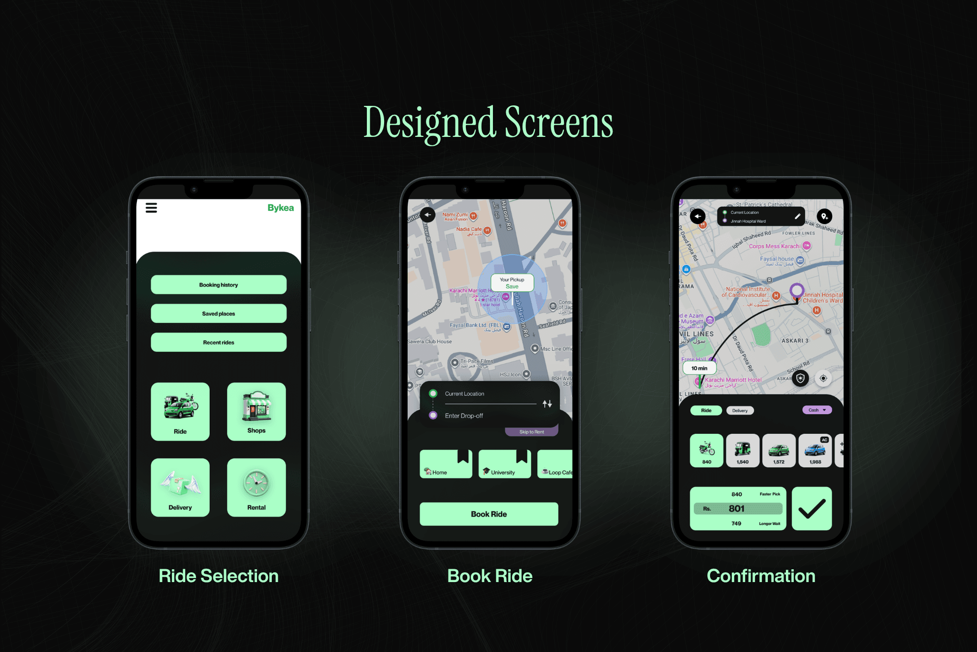
How I solved it
Rather than redesigning screens first, I started by building a consistent design system. Colours, typography, spacing, and reusable components were defined before any interface design began, ensuring every screen shared the same visual language and could scale consistently throughout the product.
I then mapped the booking journey around how a frequent rider actually books a ride. The original experience required users to make several decisions on a single screen, increasing cognitive effort before they could even request a ride.
To simplify the experience, I restructured the booking flow into four focused steps:
- Select a ride type
- Enter the destination
- Choose a vehicle
- Select a payment method and confirm
Each screen was designed around a single decision, reducing unnecessary mental effort through Progressive Disclosure (Jakob Nielsen).
To make the journey even faster, I introduced three supporting improvements:
- Default current location to match user expectations across ride-hailing apps (Jakob’s Law).
- Frequently visited destinations for one-tap selection instead of repeatedly searching for addresses (Recognition Rather Than Recall).
- Clear visual hierarchy so users focus on the primary action at every step instead of competing interface elements.
The result is a booking experience that is simpler, faster, and easier to navigate while remaining familiar to existing Bykea users.
Have something
like this in mind?
Send a short brief — I'll reply within 24 hours with honest feedback and next steps.
Start a Project →