A subscription-tracking app built around a cancellation flow that refuses to promise what it can’t verify.
- The Problem
76% of 642 subscription apps use dark patterns to block cancellation (FTC / ICPEN / GPEN, 2024). "Cancel anytime" is a promise users have learned not to trust.
- The Move
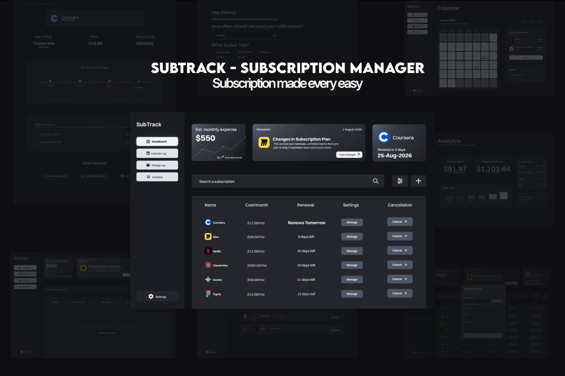
Built a subscription manager that refuses to claim what it can't prove. Three steps to add. Three steps to leave. Symmetric by design.
- The Mechanism
Every cancellation redirects to the subscription's own site rather than being processed in-app. A post-redirect check-in confirms the handoff, the product never claims a completion it can't verify.
- The Outcome
5.4× modeled user value versus a competitive premium tier's own cost. $1,796 modeled annual recurring revenue per 1,000 free users at $4.99 and 3% conversion.

A joint FTC, ICPEN, and GPEN study found that seventy-six percent of 642 subscription apps used at least one dark pattern to block cancellation. The FTC is currently suing Uber over claims that Uber One subscribers could face up to twenty-three screens and thirty-two actions just to cancel. Subscription services have no incentive to make leaving as easy as joining, and nothing forces symmetry between the two.
The person this was built for holds three to five active subscriptions, has forgotten at least one exists, and has no reason to trust a "cancel anytime" promise. These decisions were also made against a legal bar still in motion: the prior Click-to-Cancel Rule was struck down in 2025, and a replacement was still in review.
The core constraint was set before a single screen existed: the product could not claim a symmetry it could not prove. Management had already decided the app would track and redirect rather than take payment details or process cancellations directly, so adding a subscription became three steps, and so did starting a cancellation.
That is a real trade-off. A redirect-only model can never guarantee a cancellation actually completed, only that the handoff happened and the user was asked to confirm afterward. Processing cancellations directly would have allowed a cleaner metric, at the cost of storing financial data the product does not need and overselling what it can verify, the exact failure this project set out to avoid.
Every action hands the user to the subscription’s own site instead of processing it in-app. The product can only confirm it asked, not that a cancellation went through.
Comparing a full signup to a full cancellation stopped being fair once the app stopped owning either end. What survived: three steps to add a subscription, three to cancel one.
Price and plan changes are detected automatically and logged with no confirmation step. A false positive can reach the user stated as fact, a trade-off named rather than hidden.
- 01Business Goals
The goal was a cancellation flow that could not quietly hide anything, including from itself, backed by a case for real revenue rather than a portfolio piece alone.
- 02Research Synthesis
Grounded the problem in FTC, ICPEN, and GPEN regulatory data instead of the competitive audit originally planned, a real gap named directly rather than hidden.
- 03User Flow & IA
Rebuilt the sitemap around one constraint, track and redirect, not process; screen count grew from fifteen to eighteen, and the symmetry metric was redefined to three steps each way.
- 04Wireframes
Early Calendar exploration used AI ideation for a fast first pass; the output felt generic and needed manual rework to match the system once one existed.
- 05Edge Cases & Error States
The redirect model’s real edge case is an unconfirmed cancellation, handled with a post-redirect check-in rather than a false guarantee. A second edge case, AI-detected changes that could be wrong, was named as a trade-off rather than solved.
- 06Design System
Built a color system verified AA in light and dark mode by script, not by eye; four pairs failed the first pass and were iterated until they passed, plus seven components with full state specs.
- 07High-Fidelity UI
Eight screens built to spec: Dashboard, Subscription Detail, Calendar, Change Log, Add Subscription, Account Settings, Edit Profile, and Analytics.
- 08Prototyping
Every real, editable screen was assembled by hand in Figma; AI tools produced layout ideas and HTML drafts, but nothing usable as a native screen without rebuilding.
- 09Usability Testing
Ran a five-user cancellation task; five of five completed it with no reported problems. A token-level contrast audit caught two real accessibility issues and fixed both at the source.
- 10Dev Handoff
Handed off to FlyRank AI’s engineering team with every component carrying full state specs, built to be picked up and built, not just looked at.
- FigmaEvery editable screen and component; hand-assembled
- ClaudeDesign-system spec, verification script, layout discussion
- Google StitchCalendar-screen ideation (rebuilt by hand)
- MobbinPattern reference for dashboards and detail views
- DribbbleVisual reference for calendar and analytics treatments
The Outcome
This was a 10-week internship capstone at FlyRank AI, handed off to the engineering team for build, so there is no live production data yet beyond a clean five-of-five test pass. Modeled at a $4.99 price and a conservative 3% conversion, 1,000 free users project to roughly $1,796 in annual revenue. That number is illustrative, not measured; confirming it would need real usage data and testing.
Need a product problem solved?