A 30-screen real estate web platform that reads like a publication that happens to sell property.
Client Project
Sheraz Properties
Role
UI/UX Designer
Timeline
September - October 2025

  1. The Problem

    Real estate sites layer bright chrome over their photography, thumbnails compete with forms, filters, and CTAs, and buyers spend more time scanning interface than looking at property.

  2. The Move

    Inverted the pattern. Dark editorial base with a single signal color, and one component library that serves three audiences (buyer, seller, agent) with the same navigation logic.

  3. The Mechanism

    Built the component library BEFORE any high-fidelity screen so all 30 later decisions inherited real components with real states. Yellow carries every CTA, badge, and key data point, the brand is recognizable in one color, not in decoration.

  4. The Outcome

    30 hi-fi screens shipped solo in 1.5 months, delivered as a build spec with named design tokens, auto-layout on responsive elements, and hover / active / disabled variants on every interactive surface.

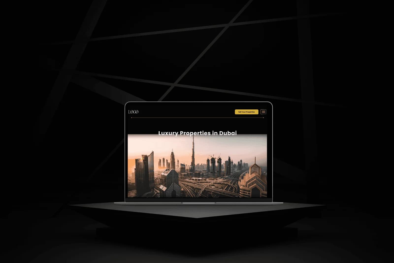
Sheraz Properties web platform hero on a laptop mockup, dark editorial layout with "Luxury Properties in Dubai" headline over a Dubai skyline image, yellow "Sell Your Properties" call-to-action in the top right

Real estate sites overwhelmingly follow the same template: bright white surfaces, small property thumbnails, forms and filters pushed to the top of every page. The result is an interface where the interface competes with the photography rather than making room for it, and buyers spend more time scanning chrome than looking at the properties they came for.

Sheraz Properties, a Dubai-based agency, needed a full web platform that could serve three audiences at once, buyers browsing listings, sellers submitting properties, and agents managing them, without any of the three feeling bolted on. The existing site treated those three surfaces as separate products with inconsistent mental models, so someone who entered through one door had to relearn the site the moment they crossed into another.

The scope was a full 1.5-month solo engagement covering user flows, wireframes, a component library, and 30 high-fidelity screens. Rather than starting screen by screen, the component library was built first so every later decision inherited a shared vocabulary, and the three user flows, buyer, seller, agent, were mapped together so the same navigation logic could carry across all of them.

The visual direction is a real trade-off. A dark editorial base with yellow accents is unusual in real estate, where buyers are used to the bright, corporate-looking portals every competitor uses. That unfamiliarity was accepted deliberately, because the goal was to let property photography lead the page rather than compete with white surfaces, and to make the brand recognizable through one confident signal color rather than through interface chrome.

Photography Leads, Interface Recedes

A dark editorial base gives every property image the whole stage instead of asking it to compete with a white background. The cost is a look that will feel unfamiliar to a first-time buyer, accepted so the photography can actually do its job.

Yellow As The Only Signal

Calls-to-action, agent badges, and key data points all carry the same yellow accent, so the brand is recognizable in one color rather than in decoration. This concentrates attention where it matters and removes the temptation to add color for its own sake.

Component Library Before Screens

The component library was built before any high-fidelity screen so every later decision inherited real components with real states. The trade-off is a slower start; the payoff is a handoff where the developer inherits consistent atomic vocabulary rather than 30 one-off layouts.

  1. 01Research

    Mapped user flows for the three audiences in parallel, buyer browsing, seller listing, agent dashboard, and content discovery, so the same navigation logic could carry across all of them rather than diverging per surface.

  2. 02Design System

    Built a dark editorial base with yellow accents, named design tokens for color, type, spacing, and radii, so every later decision inherited a shared visual language rather than being re-invented per screen.

  3. 03Wireframes

    Blocked out structure and information hierarchy before touching high-fidelity, ensuring every layout was validated against real content shape rather than pixel treatment.

  4. 04High-Fidelity UI

    30 hi-fi screens covering browsing, single-property detail, seller-lead capture, content pages, and agent-facing tools, every one built from real components with real states.

  5. 05Dev Handoff

    Delivered a Figma file with proper auto-layout on responsive elements, named design tokens, and hover, active, and disabled variants on every interactive surface, built to be picked up and built, not re-interpreted.

  • Figma30 screens, component library, design tokens, and dev handoff

The Outcome

The deliverable was a complete 30-screen web platform shipped solo in a 1.5-month engagement, covering every user flow end-to-end from browsing to agent tools. Every interactive surface was documented with hover, active, and disabled variants, every responsive element carried auto-layout, and every color, type, spacing, and radius value was a named token, so the engineering team inherited a build spec rather than a screen library. The outcome to defend here is throughput at handoff quality, thirty screens delivered under one system, not thirty one-off compositions.


30 screens
Buyer, seller, agent, and content surfaces in one system
1.5 months
Solo end-to-end, from user flows to dev-ready handoff

Need a product problem solved?

A 30-screen real estate web platform that reads like a publication that happens to sell property. · SaribPXL