Redesigning Bykea’s ride-booking flow so it asks for one decision at a time instead of five at once.
- The Problem
Bykea's home screen asked riders for six decisions at once — pickup, destination, vehicle, price, payment, confirm — before a single tap of progress. New users stalled before they started.
- The Move
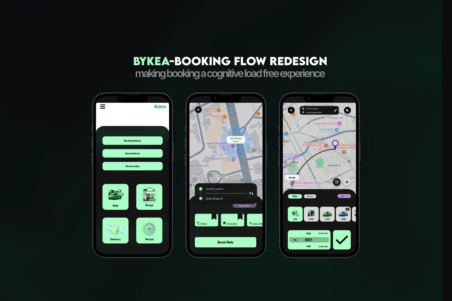
Traded one dense screen for a sequence of three simple ones. Every screen resolves exactly one decision.
- The Mechanism
Pickup auto-fills from GPS. Home and Work surface at one tap for frequent destinations. Vehicle and price get their own screens instead of competing for the same real estate.
- The Outcome
Modeled 5-10% booking-completion uplift against Bykea's PKR 18.40B-19.27B annual revenue base, PKR 876M-1.75B in illustrative revenue potential.

Bykea’s home screen asked a rider to choose a pickup, enter a destination, compare vehicles, review pricing, select a payment method, and confirm, all on one screen. That was not a matter of visual clutter; it meant a new user had to process six decisions before completing a single booking. Riders were not abandoning the app because it looked outdated. They were abandoning it because getting a ride took more thinking than it should have.
Informal interviews with people who use ride-hailing apps regularly turned up the same complaint every time: they knew exactly what they wanted, book a ride, but the flow itself got in the way. One rider switched to a competitor within a week of trying Bykea, not over price, but because the home screen asked him to think before it let him move.
Rather than reworking the entire app, the redesign focused on a single journey: the path from opening Bykea to a confirmed ride. InDrive and Yango, both used daily as a working comparison, never ask for more than one decision per screen, and that became the target to build toward.
Hitting that target meant trading Bykea’s one dense screen for a sequence of three simpler ones. That is a real cost: more screens to move through before a ride is booked. The bet was that a rider moving confidently through three easy steps beats a rider stalling on one screen that asks for too much at once, and the interviews backed that bet before a single screen was built.
Pickup location fills in automatically from the phone’s GPS, the same way every other app already works. The trade-off is a rare case where the location is slightly off, against removing a needless extra tap for nearly every other ride.
Home, work, and a handful of regular spots surface for a single tap instead of a fresh address search every time. This only helps repeat trips, not first-time addresses, but most bookings are repeat trips, so it is a bet worth making.
The original flow crammed six decisions onto one screen to save taps. The redesign trades that for three simpler screens: more screens to move through, but each one only asks for what matters at that moment, so riders stop stalling before they even start.
- 01Problem Framing
Audited the flow against InDrive and Yango, then scoped the redesign to one journey.
- 02Research
Informal interviews confirmed the same complaint: users knew what they wanted, the flow got in the way.
- 03Decision-Load Mapping
Mapped the real user journey and rebuilt it so each screen resolves one decision.
- 04Solo Execution
Built the flow solo in Figma, about twelve hours, no AI wireframes.
- FigmaEvery screen and the design system, hand-built solo
- MobbinPattern reference for ride-hailing app flows
- DribbbleVisual reference for card and dark-mode palettes
The Outcome
This was a personal project, never shipped, so there is no live data to report. Modeled against Bykea’s estimated PKR 18.40B to 19.27B annual revenue, a 5 to 10% lift in completed bookings could mean PKR 876M to 1.75B in additional revenue. That number is illustrative, not measured; confirming it would need real analytics and A/B testing.
Need a product problem solved?